Colors psychology is the study of hues as a determinant of human behavior. Colors can influence a person’s mood, emotions, and even thoughts. With that in mind, it becomes clear why choosing the right colors for your home is so important. The wrong colors can make you agitated, while the right colors can help you relax and feel at ease. Every shade affects the human brain differently, so it’s important to choose wisely. It’s not just about aesthetics; it’s about how the colors make you feel.
The following pro-designer tips will help you choose the right color palette for your home:
Think About the Feel
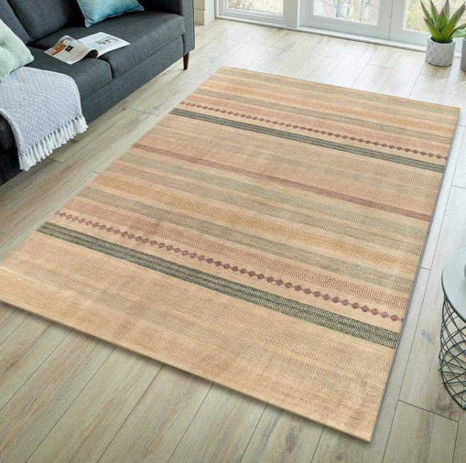
Your home should reflect the mood you want to feel when you’re there. Do you want it to be relaxed, calm, and serene? Or bright and cheerful? The colors you choose will play a big role in setting the tone. All colors affect the human brain differently, so choose wisely. If you want a calming space, stick to cool colors like blues and greens. For a cheerful space, go for warmer colors like yellow and orange. Once you decide your hues, bring area rugs, accessories, and art into the space to add pops of color and personality. A mix of both light and dark hues will create depth and interest.
Consider Your Style
Your color palette should also reflect your style. If you prefer a more minimalist aesthetic, stick to a monochromatic color scheme. You can achieve it using different shades, tints, and tones of the same hue. If you love mixing and matching colors, go for an analogous or complementary color scheme. Analogous hues are next to each other on the basic color wheel, while complementary colors are opposite each other on the wheel. Your color palette can also be a reflection of your favorite season. For example, if you love fall colors, you might want to use a palette with warm earth tones.
Think About The Mood
The mood of your space is another important factor to consider when choosing a color palette. Different colors can evoke different emotions.
The colors you choose will also set the tone and create a certain mood in your space. For a calming and relaxing vibe, stick to cool colors like blues, greens, and purples. Warm colors like reds, oranges, and yellows make a space feel more inviting and energetic. For a happy and cheerful space, try using a bright color palette. And for a more dramatic and luxurious feel, opt for a rich and vibrant color scheme.
Consider The Undertones
When choosing paint colors, it’s important to look at the undertone of the shade. The undertone is the hue that comes through when a color is mixed with white, black, or gray. It can be either warm or cool. To figure out the undertone of color, ask yourself if it looks more like a warm or cool color Guest posting sites.
Warm colors have undertones that are yellow, orange, or red. Cool colors have undertones that are green, blue, or purple. Neutrals can go either way—they can have warm or cool undertones.
If you’re unsure what undertone a color has, try this trick: Place two colors side by side and see which one looks brighter. The brighter color will have a more dominant undertone.
Neutrals Are Your Friend
If you’re having trouble picking out a color palette, neutral colors are always a safe bet. Neutrals can be easily combined with other colors and help tie a space together. You can also use neutrals as a base and then add pops of color with accessories to create a cohesive look. For example, if you have a neutral or pale living room, you can add color with pillows, throws, and artwork or balance the look with colorful Persian rugs. Neutral or earthy tones also work well in bedrooms and create a calming atmosphere. They instantly calm space and can be combined with other colors or left as is for a serene look.
Think About the Light
The natural light your home gets will also affect the paint colors you choose. If you have a lot of windows and receive a lot of sunlight, opt for lighter colors to help brighten up the space. If your home is darker, go for richer, deeper tones to add warmth. You can also use light and dark colors to create contrast and visually expand or shrink a space. Lighting can also affect a color’s appearance, so test it out in the space before committing. It might look different than you expected! Likewise, paint colors can also look different depending on the time of day, so test them out at different times throughout the day to get a true sense of how they’ll look.
Think About the Function
When choosing a color palette, the room’s function should also be considered first. A brighter color might not be ideal for a bedroom where you’re trying to create a calming atmosphere. And a dark color might not be the best choice for a mudroom where you’re trying to keep things light and airy. Consider the room’s feel and choose colors accordingly. The function is the most important thing to consider when choosing a color palette for your home. It’s also important to keep in mind that colors can be used to create different atmospheres. Dark colors can make a space feel more intimate, while light colors make it more open.
Look at Your Existing Furnishings
Your existing furnishings can be a great starting point for choosing your color palette. If you have a piece of furniture that you love, use it as inspiration and build your color scheme around it. Use wall art, rugs, or other accessories to guide your color selection. Your goal should be to create a cohesive and stylish space. You may also take cues from nature. If you live near the beach, you might want to incorporate colors that reflect the ocean and sand. If you live in the mountains, consider using earth tones.
Think Wisely
You can’t just choose any color you want and expect it to work in your home. You must think carefully about the colors you select and how they will work together. A color rule is to use three colors: a dominant color, a secondary color, and an accent color. The dominant color should be used for large surfaces such as walls or floors. The secondary color can be used for smaller surfaces such as furniture or décor. And the accent color should be used sparingly to add pops of interest.
To create a harmonious space, it’s important to understand which colors work well together and which ones clash. A good place to start is by understanding the color wheel. Colors opposite each other on the wheel are considered complementary or in harmony. These colors will create a pleasing contrast when used together.
Summing Up!
While it’s important to consider the psychology of color, it’s also crucial to consider your style and what will make you happy. With these tips in mind, we hope you feel confident in picking the perfect color palette for your home. If you need more help narrowing down your options or want to buy rugs from RugKnots, head to our website. You will see how fabulous your home looks with its new rug!
